23-C1
CASESTUDY
CASESTUDY
23-C1
PROJECT
PROJECT
Accès
Website Design +Visual Identity

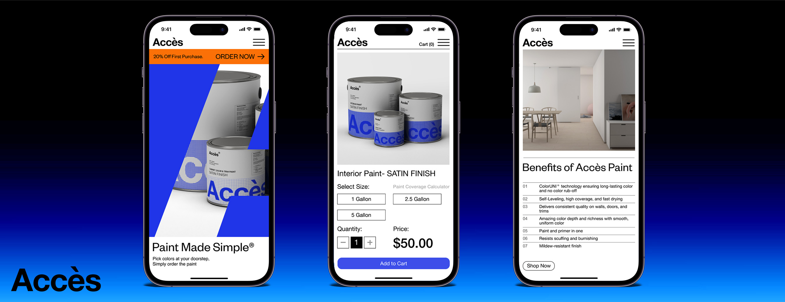
Accès is a newly founded paint manufacturer with only an online presence, and dedicated to changing the way paint is manufactured, distributed and used. The company was founded on the principle that consumers should have access to high quality paint directly from the manufacturer. Their mission is to provide consumers with a high quality product that is delivered directly to the consumer and easy to use.
2023/5/11
Role
Role:
This is a Concept case study project.
UX Designer
IxD Designer
UI Designer
Visual Designer
Responsibilities
Interaction Design:
High-fidelity interactive prototypes for key tasks
UX/UI Design:
Competitive analysis
User surveys and one-on-one interviews
Personas
User journeys and task flows
Site map
Low-fidelity wireframes
High-fidelity mockups and prototypes
Design system
Usability tests and findings
Visual Identity:
Logo
Color palette
Typography
Project Specifications
Project Specifications
Duration:
4 weeks
Tools:
Figma
Photoshop
Illustrator
Design Process
Empathize ︎︎︎ Define ︎︎︎ Ideate ︎︎︎ Prototype ︎︎︎ Test
Project Overview / Background
The classic business model for paint manufacturers has always been to distribute their products through brick-and-mortar paint retailers. These paint retailers then supply to the consumers. This model works well for established paint manufacturers as they can afford paying a percentage of their profit margins to the paint retailers. As operating costs keep increasing, due to the current global economic climate, new paint startups have few options to maintain operating costs and profit margins. With the classic model new paint manufacturers had only few options to position themselves in the market. These options were as follows: By investing large amounts marketing their products, providing a higher percentage of their profits to paint retailers, or investing and operating costly brick-and-mortar businesses.
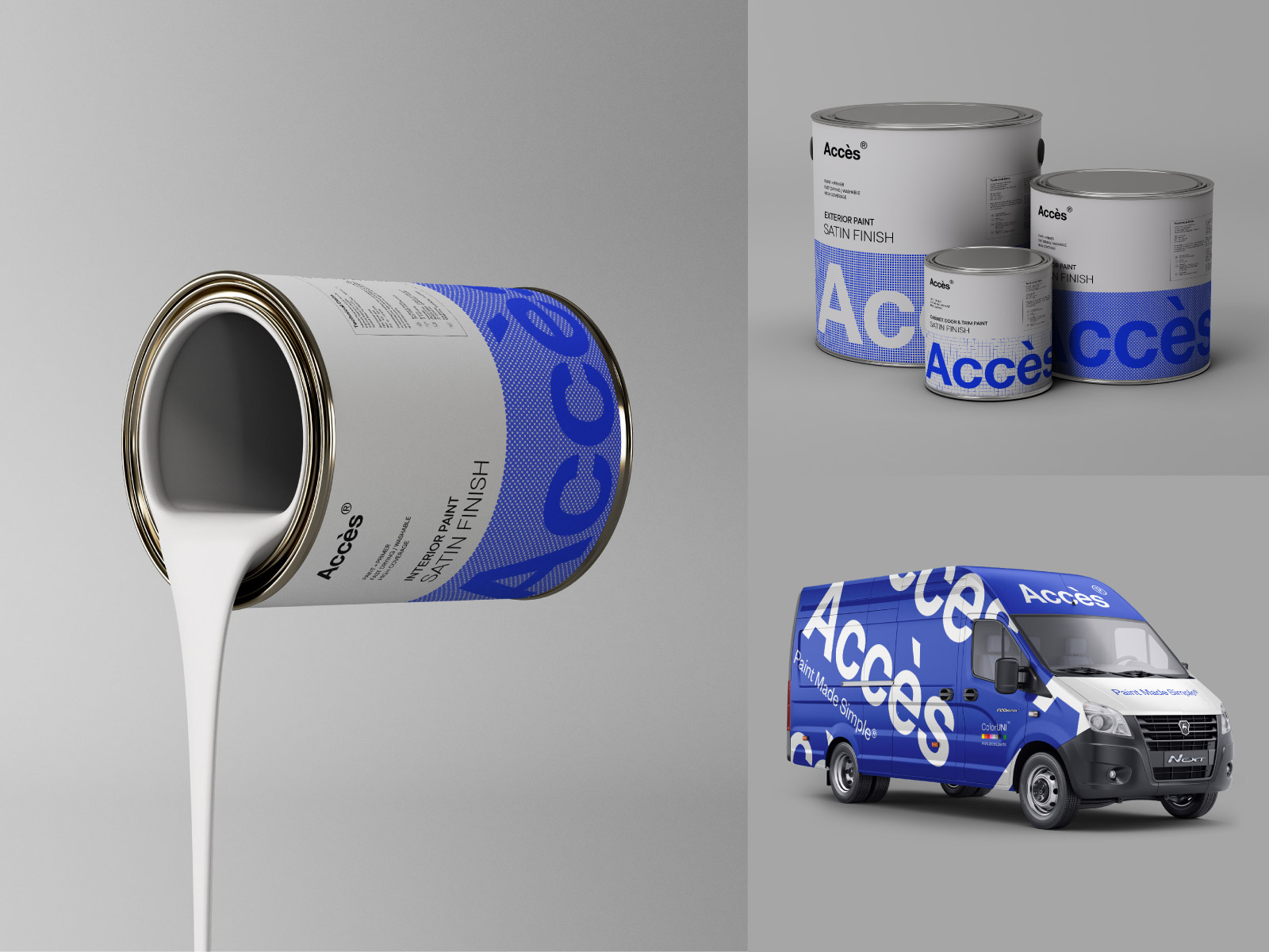
Acces Paints decided to take on a new business model, which was to sell its product only online using its fleet of Vans(specially designed Vans fitted with unique paint color mixers on board) to distribute directly to consumers, and providing free color consultation and selection at consumers doorsteps.
Problems & Solutions
Problems
- Acces Paints required a simple responsive ecommerce website design & visual identity, along with a focus on their new business model. The client's vision was to simplify the paint industry for end users.
- Addressing user difficulties in choosing and assessing paint color palettes.
- Lack of understanding by end users for new Acces Paints business model
Solutions
- Design a new website design that matched the client's brand and business goals that reflected core UX/UI design practices.
- Simplify Product lines and the purchasing process for paint consumers.
- Educate the consumers on the Acces Paints business model.
- Provide incentives for purchasing online: Free color consultation and selection at consumers doorstep
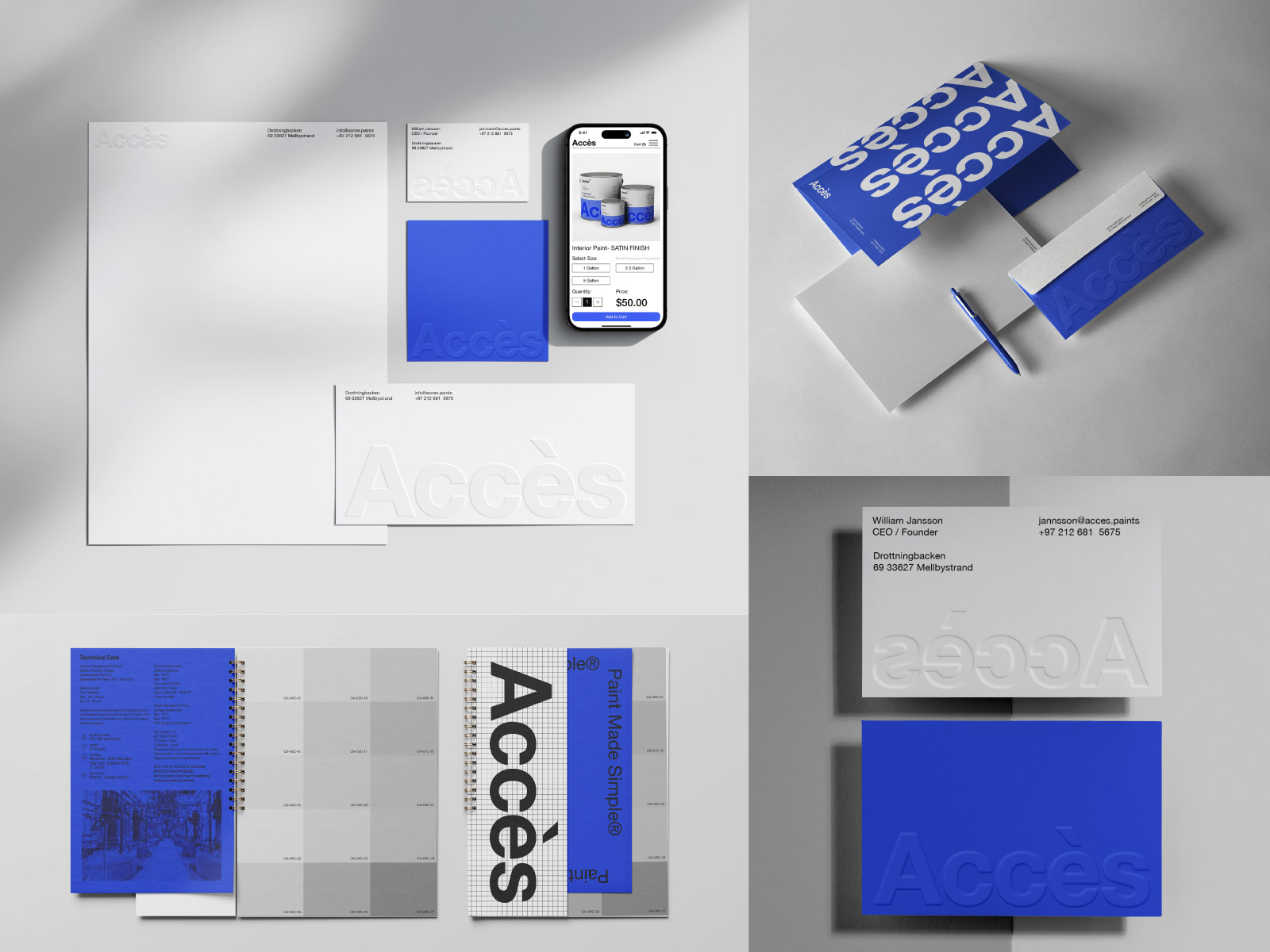
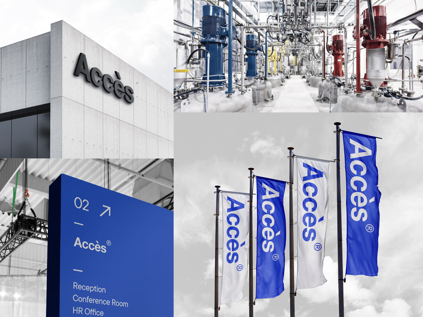
- New visual identity that effectively communicates Accès Paints unique personality

Research
Initial research was done to determine the competition space to better understand other paint manufacturers online presence. Secondary research data provided much needed quantitative insight about online paint sells, market trends, and demographics. Using this data, I conducted user surveys to help identify and quantify the issues consumers have with purchasing paint online and how to resolve those issues. Finally, as part of my user research I conducted interviews and created empathy maps to understand the users and their needs.
COMPETITIVE ANALYSIS
(click to view)
(click to view)

Findings
- Users are overwhelmed by the number of paint products, technical terminology, and paint application methods.
- The frustrations users face while choosing paint color palette and receiving the wrong paint color.
- Concerns with financial loss, “Paint is expensive and I don't want to risk purchasing such an expensive product online with no refund policies available.”
- Confusions with needed tools for achieving a professional paint finish.
User Personas
Defining Key Differences in Motivations Through Personas
User Persona
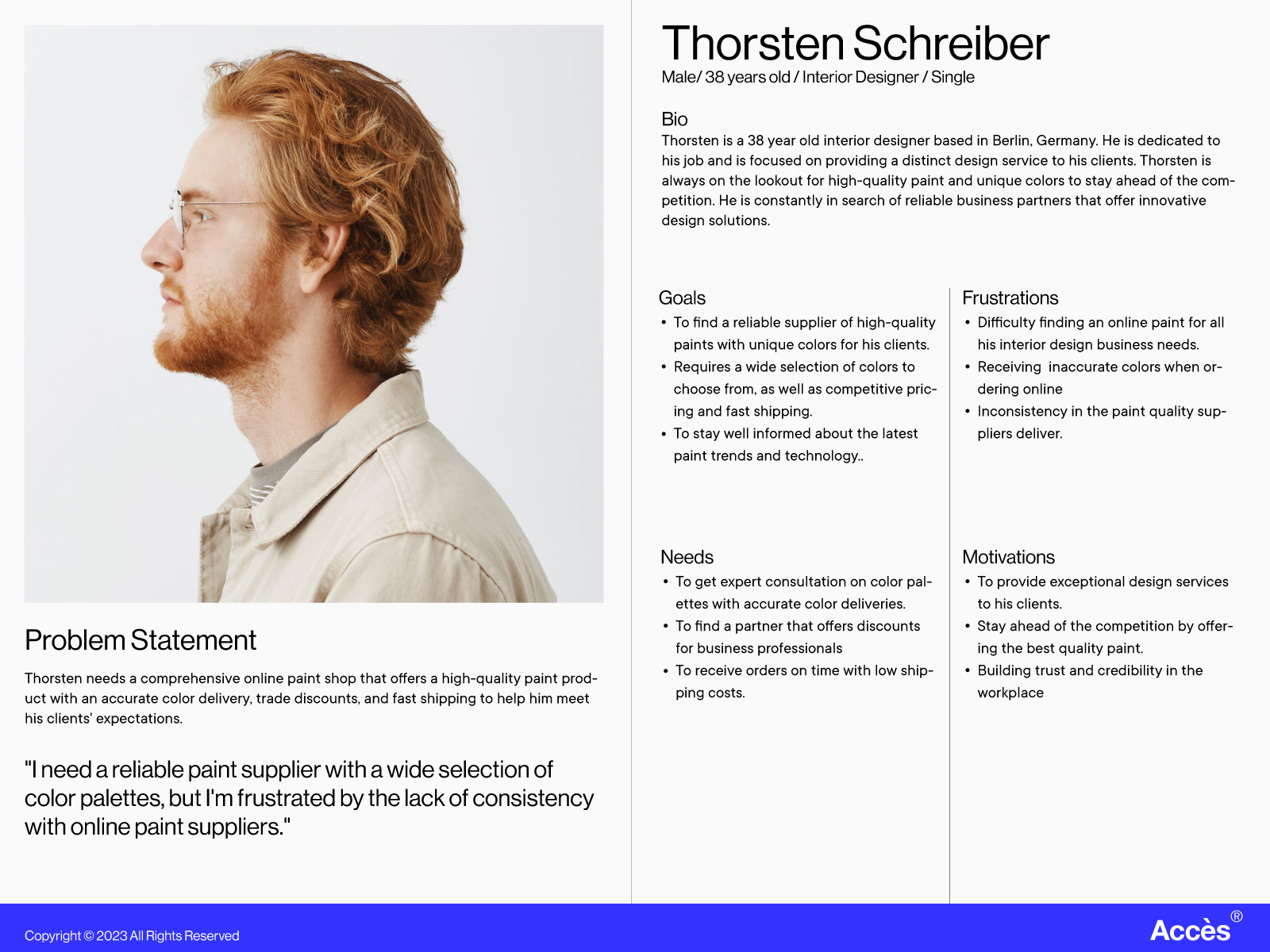
With focus on user-centered design, user personas were created to help bring clarity to my design process. By using patterns from my empathy map I developed a deep understanding of users' goals, motivations, and pain points. I focused on two personas that best represented the key functions of the product and prioritized my efforts toward meeting the needs of the target audience.
PERSONAS
(click to view)
(click to view)

User Journey Maps
Investigating Common Tasks to Increase User Empathy
I identified important emotional and procedural contact points that Accès website needed to address, by constructing and exploring user journey maps of the two personas and their tasks flows. Key tasks that created anxiety for users were: Color selection, Product selection, and check out process.
USER JOURNEY MAPS
(Click to view)
(Click to view)


User Flow
Once these tasks were identified user flows were created to map out user steps when using Accès website. The objective here was to create a process that makes the purchasing of paint online as simple and effortless as possible for users.
USER FLOW
(Click to view)
(Click to view)

Sitemap
The sitemap was developed by focusing on creating information architecture that would improve task streams for users based on data collected from surveys and interviews. The three major task streams that would guide the planning of the sitemap were: Informing users on color selection, product selection, and check out process.
SITEMAP
(Click to view)
(Click to view)

Paper Wireframes
User-centered Visualization through Paper Wireframes
Sketching paper wireframes allowed me to connect the site's information architecture to its visual design by showing different paths between pages. Paper wireframes guided the exploration and conceptualization of standard design patterns among competition, determining which patterns were important to develop further. Furthermore, different device screen types were also explored to clarify consistent ways to present information and functionality to users.
PAPER WIREFRAMES SKETCHES
(Click to view)
(Click to view)


Low-Fidelity Prototypes
Low-fidelity prototypes were created based on initial sketches with focus on users' tasks, and through an unmoderated usability study of the lo-fi prototypes (involving 6 participants) three major findings were uncovered:
1) Confusion about color and finish selection for paint products.
2) Actionable and consistent iconography.
3) Simpler and faster checkout process.
Based on the insights from the usability study, I pushed forward with materializing the hi-fi prototypes, as I was certain about the modifications that needed to be achieved for a well-rounded user-centered product.
LOW FIDELITY PROTOTYPES


High-Fidelity Prototypes
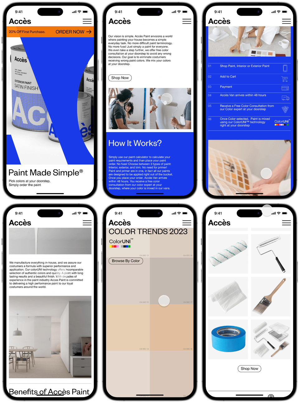
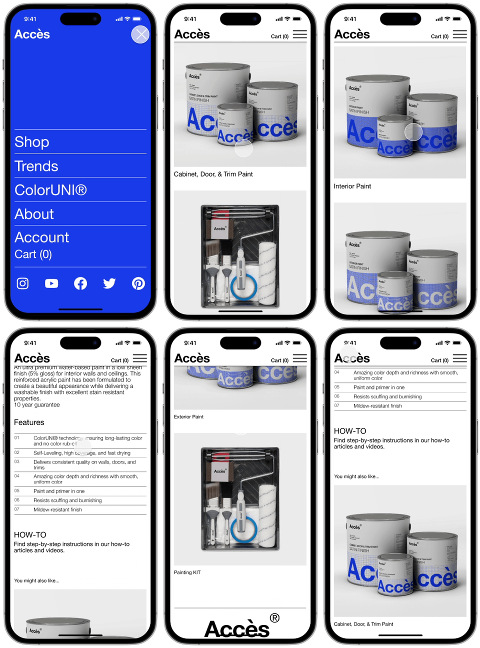
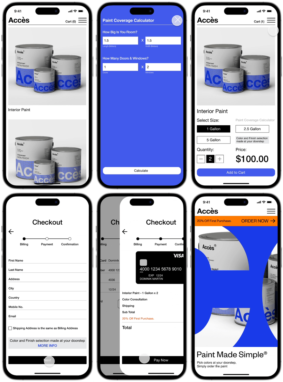
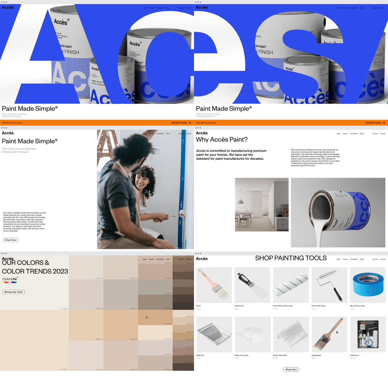
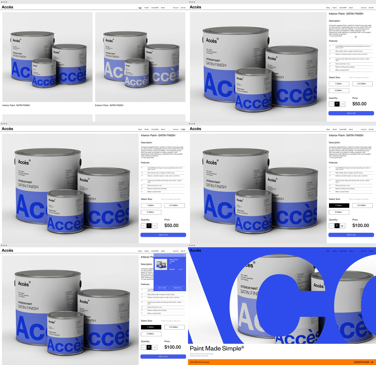
Further round of user research using behavioral and attitudinal KPIs (Time-on-task, User error rate, conversion rate, and SUS) was conducted on the high-fidelity prototype to test the full experience of the responsive website on users. The testing concluded very few issues with the responsive website and all rates were satisfactory.
While users were able to easily complete the checkout process , one issue that arose was at the confirmation stage of the checkout, users required more information on how and when exactly Accès will contact them for booking finalizations. Another issue brought up was the lack of a search bar in the website, a decision was made to simplify the website as much as possible to deal with this issue (for example offering only 4 product categories).
(Please allow the GIF files to load)
MOBILE WEBSITE
DESKTOP WEBSITE
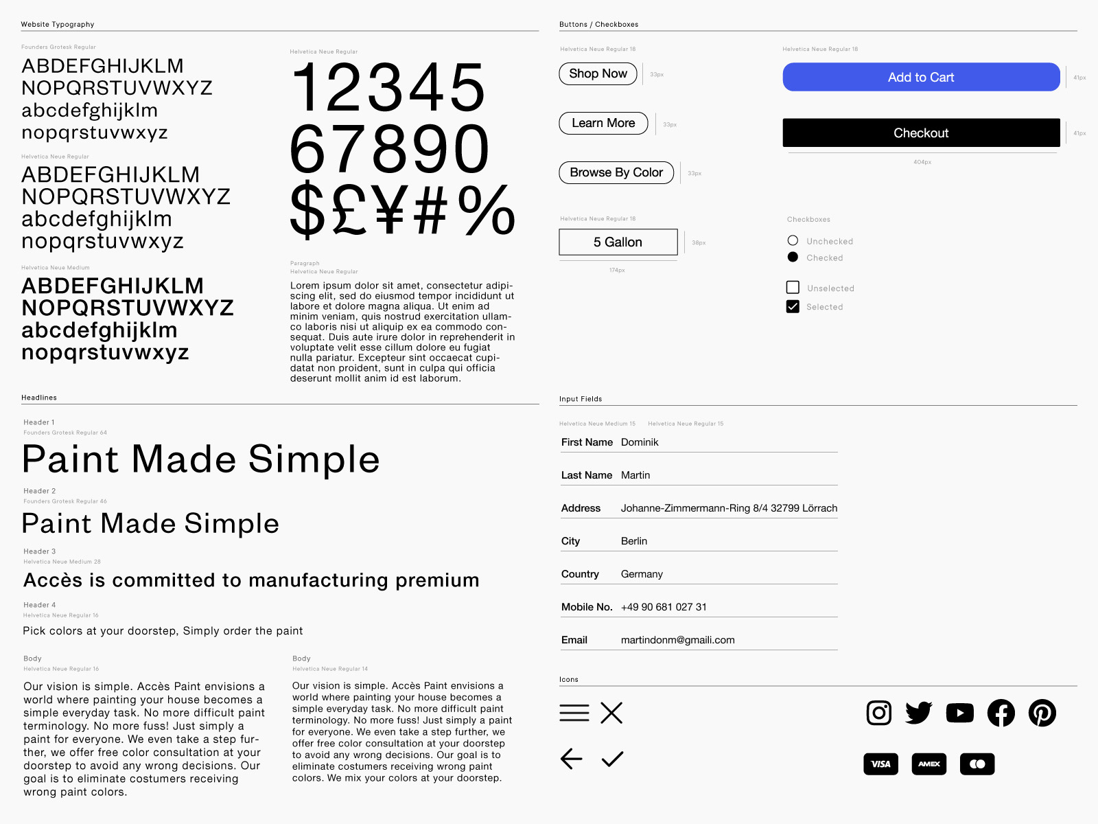
BRAND IDENTITY /
DESIGN SYSTEM
(Click to view)
DESIGN SYSTEM
(Click to view)

Improvements on Usability Issues for Long-term Development
1. Providing a search bar and filtering options as Accès product range increases.
2. Clear confirmation stage notifications through email and sms.
3. Implementing better feedback and clear error messages when users encounter issues.
4. Improvements on design systems for the responsiveness of the website, for example buttons and other elements that users find irritating.
Going Forward : Takeaways
1. While designing the Accès responsive website, I learned that I had to put aside assumptions made about ecommerce websites. Focusing on feedback from my usability studies truly guided the product design and resulted in a better user-centered product.
2. Implementing effective SEO: It is important to plan a SEO strategy from the start, especially for ecommerce websites. Using relevant keywords, optimizing product descriptions, and creating quality content must all be considered.
3. Accès responsive website truly achieved the goals that were set. Helping Accès to focus on online sales and most importantly achieving user satisfaction with ordering paint online.
One quote from peer feedback:
“Ordering paint has never been easier, love the free color consultation and color selection process.”
4. Next step would be to conduct a further round of usability studies, to determine whether the pain points users experienced have been addressed in the final version. Also reviewing the website's analytics to understand user behavior and make necessary adjustments that would be needed in the future.
Accessibility considerations: Provide features for vision impaired users by adding alt text to images for screen readers. Placing annotation markers next to interactive UI elements on the pages. Different sized headings were used to indicate the visual hierarchy.
︎︎︎BACK
© 2024 All Rights Reserved


